
" transform="translate(9.5 9.5)" width="15.407000000000004px"/></svg>)
" transform="translate(9.5 9)" width="13.866000087738037px"/></svg>)
" width="18.489px"><path d="M 0 0 L 18.489 0 L 18.489 18.489 L 0 18.489 Z" fill="transparent" height="18.489px" id="LQTNtcjyE" width="18.489px"/><path d="M 4.623 9.158 C 4.623 9.158 5.779 10.698 7.705 10.698 C 9.631 10.698 10.786 9.158 10.786 9.158 M 10.016 5.306 L 10.024 5.306 M 5.394 5.306 L 5.401 5.306 M 15.408 7.616 C 15.439 10.389 13.978 12.965 11.581 14.361 C 9.185 15.757 6.223 15.757 3.827 14.361 C 1.43 12.965 -0.031 10.389 0.001 7.616 C 0.049 3.396 3.483 0 7.704 0 C 11.925 0 15.359 3.396 15.408 7.616 Z M 10.401 5.306 C 10.401 5.519 10.228 5.691 10.016 5.691 C 9.803 5.691 9.631 5.519 9.631 5.306 C 9.631 5.094 9.803 4.921 10.016 4.921 C 10.228 4.921 10.401 5.094 10.401 5.306 Z M 5.779 5.306 C 5.779 5.519 5.606 5.691 5.394 5.691 C 5.181 5.691 5.009 5.519 5.009 5.306 C 5.009 5.094 5.181 4.921 5.394 4.921 C 5.606 4.921 5.779 5.094 5.779 5.306 Z" fill="transparent" height="15.407999999999998px" id="dCQPcjIQ7" stroke-dasharray="" stroke-linecap="round" stroke-linejoin="round" stroke-width="1.444" stroke="rgb(22, 37, 86)" transform="translate(1.54 1.626)" width="15.40800435478724px"/></g></svg>)
" width="18.448500000000024px"><path d="M 8.558 8.627 L 4.278 8.627 C 2.799 8.627 0 7.725 0 4.314 C 0 0.901 2.799 0 4.279 0 L 7.946 0 C 10.364 0 11.003 2.016 11.003 3.081 C 11.003 5.519 9.003 6.163 7.946 6.163 L 4.28 6.163 C 3.543 6.163 2.446 5.67 2.446 4.314 C 2.446 2.958 3.543 2.465 4.28 2.465 L 8.559 2.465 L 8.559 3.698 L 4.279 3.698 C 4.005 3.705 3.669 3.818 3.669 4.314 C 3.669 4.81 4.005 4.923 4.287 4.93 L 7.947 4.93 C 8.251 4.927 9.781 4.821 9.781 3.081 C 9.777 2.775 9.673 1.232 7.947 1.232 L 4.28 1.232 C 3.97 1.235 1.224 1.341 1.224 4.314 C 1.224 7.36 4.155 7.396 4.28 7.396 L 8.559 7.396 L 8.559 8.628 Z" fill="rgb(22, 37, 86)" height="8.628px" id="EigxOzgP5" transform="translate(0 2.5)" width="11.002999999999986px"/><path d="M 12.438 0 C 12.995 0 13.449 0.453 13.449 1.012 L 13.449 17.478 C 13.449 18.036 12.995 18.489 12.438 18.489 L 1.012 18.489 C 0.453 18.488 0.001 18.036 0 17.478 L 0 12.938 C 0 12.601 0.274 12.327 0.611 12.327 C 0.949 12.327 1.223 12.601 1.223 12.938 L 1.223 16.245 C 1.223 16.804 1.676 17.257 2.235 17.257 L 11.215 17.257 C 11.483 17.257 11.74 17.15 11.929 16.96 C 12.119 16.771 12.225 16.513 12.225 16.245 L 12.225 2.245 C 12.225 1.977 12.119 1.719 11.929 1.53 C 11.74 1.34 11.483 1.233 11.215 1.233 L 0.616 1.233 C 0.276 1.233 0 0.957 0 0.617 C 0 0.276 0.276 0 0.616 0 L 12.437 0 Z" fill="rgb(22, 37, 86)" height="18.489000000000004px" id="NuhJn7FzE" transform="translate(5 0)" width="13.448500000000024px"/></g></svg>)
Tern Travel

Team
Myself (UX Designer)
Aashish Virk (UX Designer)
Cecilia Yang Liu (UX Researcher)
Sarah Schacht (UX Researcher)
Overview
Collaborated with three user experience design students to solve the need to pack and culturally adapt before travelling through a mobile app concept for a Master’s level course INF1602 (Fundamentals of UXD).
Timeline
4 Months (Sep—Dec 2024)
Tools
Figma, Microsoft 365, Otter.ai


Highlights
A guided packing list that turns cultural unknowns into a checklist.
By focusing on potential stressors for young adults when packing, we created a personalized location specific packing list organizer for new destination travelers.


Problem
When the language, customs, and even the weather are unfamiliar and unpredictable, packing stops being a checklist and starts being a source of anxiety long before a trip even begins.
Discovery
Target Audience
Our primary audience is 18 to 35 year old North Americans who trust internet and social media advice over guidebooks, and who travel more for leisure than business.

Liam wants to …
To experience something new without accidentally disrespecting a culture he’s visiting.
Packing completed fast, not another research project before the trip even starts.
A plan for the things they can't control, like weather, safety, or unfamiliar customs.
Competitor Analysis
Common packing organizer apps only solve pieces of the problem for Liam:
Tripit

Strength: Itinerary tracking
Gap: No packing support
Packpoint

Strength: Variable tracking (weather)
Gap: No cultural context
Apple Notes

Strength: Convenience
Gap: Uninformative
User Interviews
We interviewed 8 participants for 15 minutes each, screening for fit against our target audience beforehand. I conducted 2 of the 8, and transcripts were pooled into an affinity map and coded into 3 recurring pain points:

Design
Flow Diagram
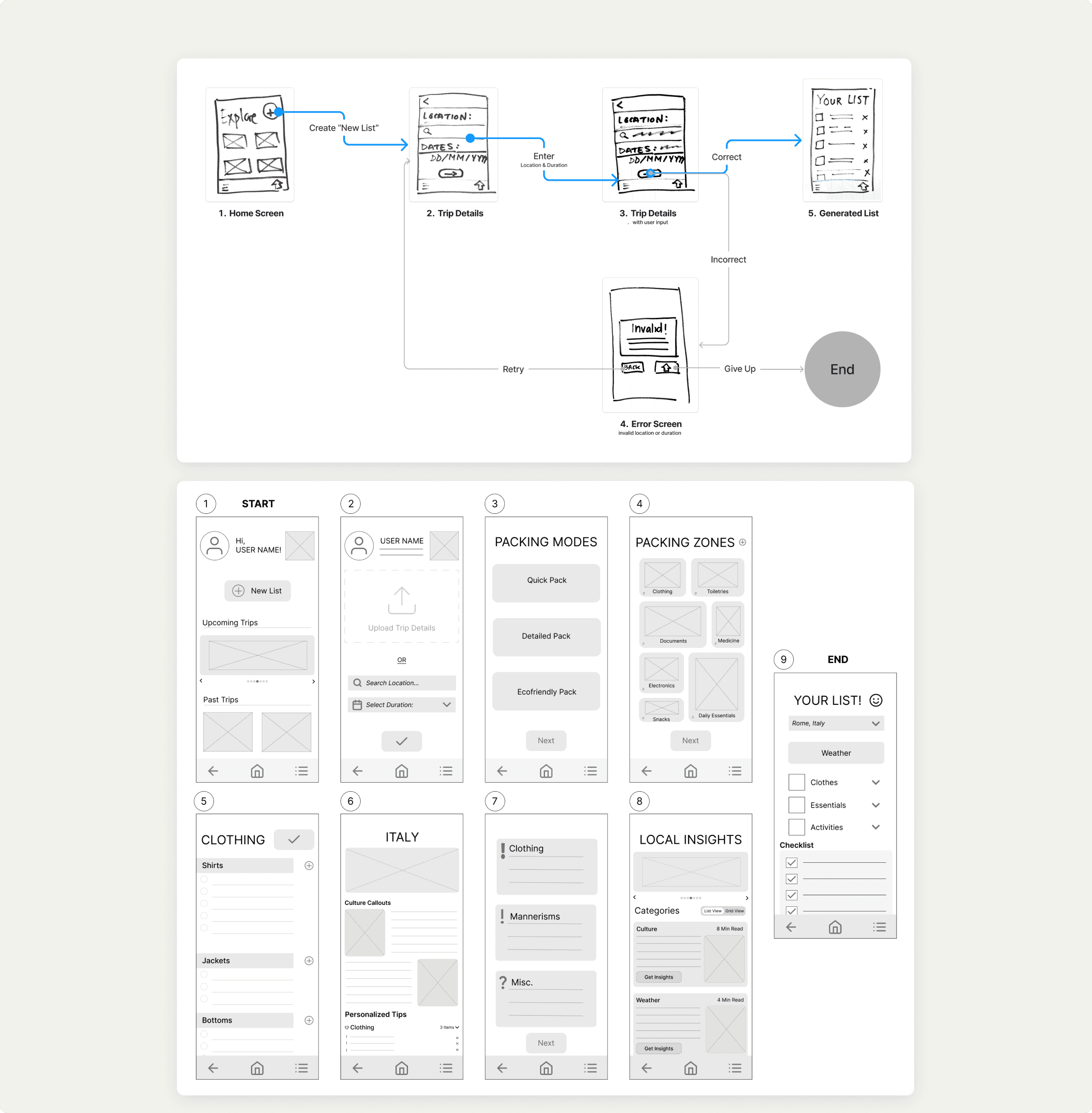
We set-up a basic fundamental task for the user to follow within a mobile app to help for packing: creating a new list for a new trip, setting up an essential task before embedded the cultural twist.

Ideation
Initial Sketching
I sketched various features, icons, screen ideas, and ranked valuability of features worth implementing to see what is the most important for our target user.

Lo-fidelity Storyboards
After rough paper drafts, I combined these screen sketches with the flow chart to how to user’s journey throughout their main usage of the app.


Branding and Visual Identity
We created a moldboard and individual style tiles to find a tonality for the look and feel of Tern Travel, centered around five words: lightweight, earthy, modern, calming, and exploration. The final palette shifted toward blue and yellow to differentiate between TripIt.

Solution
Design Decisions
Concluding the design phase, we presented our prototype and findings to industry experts and our peers, with the following features at the forefront:
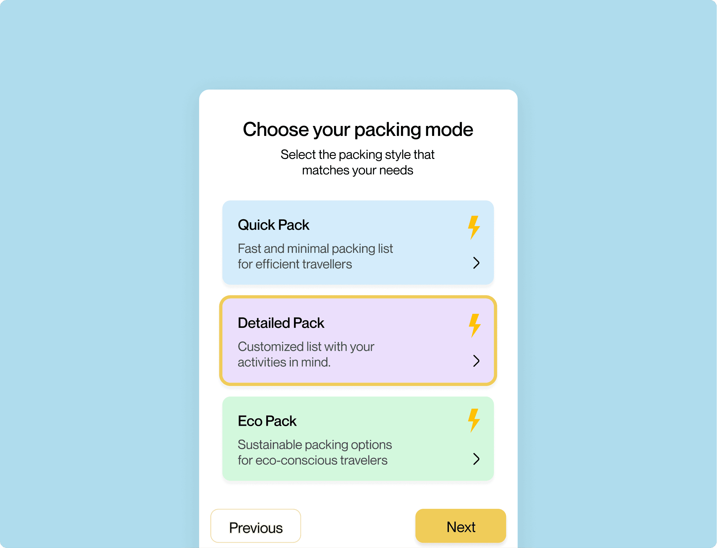
Quick, Detailed, and Eco Pack let users choose their own prioritization levels for initial list generation and quick access to valued learnings and items.


Cultural etiquette and context show up before the packing list, highlighting the importance and standout feature of Tern Travel over others.
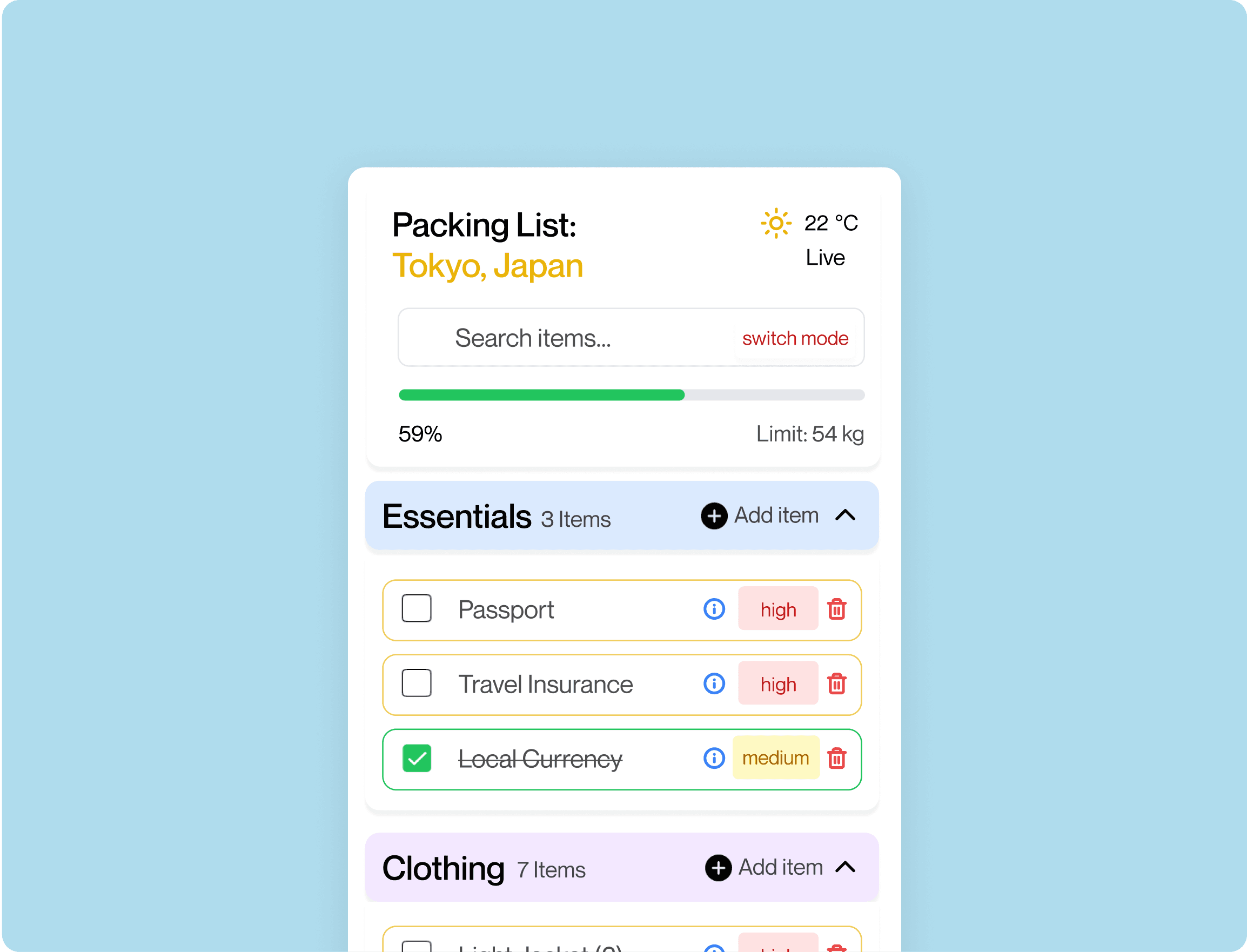
Indicating planned activities upfront lets the generated list account for proper attire and equipment automatically.


Every generated item includes a drop-down tool tip explaining why it's there, and prioritization level in accordance with packing mode selection, so users can trust and adjust as needed.
Fun Fact: the name “Tern Travel” is inspired by the arctic tern bird which has one of the longest known migration routes - travelling more than 80,000km/year! (Ocean Conservancy).
Learnings
Design and scope will evolve.
This project began as a travel wardrobe solution, pivoting ideas three times throughout the process, teaching us that clear research foundation early on saves valuable time during refinement stages. We started broad and kept cutting until only the strongest idea was left.
Research over aesthetics.
Through user interviews, testing, and empathy mapping, we uncovered pain points that challenged our assumptions, allowing for more intuitive and user-centred experiences.
WCAG 2.0 considerations.
After our final round of feedback, the colour palette chosen was flagged as too distracting at high fidelity with an almost too many competing number of shades. In future iterations, this app would stick to higher contrast blue and a lighter yellow colour to be less distracting and be more accessibly friendly.