
" transform="translate(9.5 9.5)" width="15.407000000000004px"/></svg>)
" transform="translate(9.5 9)" width="13.866000087738037px"/></svg>)
" width="18.489px"><path d="M 0 0 L 18.489 0 L 18.489 18.489 L 0 18.489 Z" fill="transparent" height="18.489px" id="LQTNtcjyE" width="18.489px"/><path d="M 4.623 9.158 C 4.623 9.158 5.779 10.698 7.705 10.698 C 9.631 10.698 10.786 9.158 10.786 9.158 M 10.016 5.306 L 10.024 5.306 M 5.394 5.306 L 5.401 5.306 M 15.408 7.616 C 15.439 10.389 13.978 12.965 11.581 14.361 C 9.185 15.757 6.223 15.757 3.827 14.361 C 1.43 12.965 -0.031 10.389 0.001 7.616 C 0.049 3.396 3.483 0 7.704 0 C 11.925 0 15.359 3.396 15.408 7.616 Z M 10.401 5.306 C 10.401 5.519 10.228 5.691 10.016 5.691 C 9.803 5.691 9.631 5.519 9.631 5.306 C 9.631 5.094 9.803 4.921 10.016 4.921 C 10.228 4.921 10.401 5.094 10.401 5.306 Z M 5.779 5.306 C 5.779 5.519 5.606 5.691 5.394 5.691 C 5.181 5.691 5.009 5.519 5.009 5.306 C 5.009 5.094 5.181 4.921 5.394 4.921 C 5.606 4.921 5.779 5.094 5.779 5.306 Z" fill="transparent" height="15.407999999999998px" id="dCQPcjIQ7" stroke-dasharray="" stroke-linecap="round" stroke-linejoin="round" stroke-width="1.444" stroke="rgb(22, 37, 86)" transform="translate(1.54 1.626)" width="15.40800435478724px"/></g></svg>)
" width="18.448500000000024px"><path d="M 8.558 8.627 L 4.278 8.627 C 2.799 8.627 0 7.725 0 4.314 C 0 0.901 2.799 0 4.279 0 L 7.946 0 C 10.364 0 11.003 2.016 11.003 3.081 C 11.003 5.519 9.003 6.163 7.946 6.163 L 4.28 6.163 C 3.543 6.163 2.446 5.67 2.446 4.314 C 2.446 2.958 3.543 2.465 4.28 2.465 L 8.559 2.465 L 8.559 3.698 L 4.279 3.698 C 4.005 3.705 3.669 3.818 3.669 4.314 C 3.669 4.81 4.005 4.923 4.287 4.93 L 7.947 4.93 C 8.251 4.927 9.781 4.821 9.781 3.081 C 9.777 2.775 9.673 1.232 7.947 1.232 L 4.28 1.232 C 3.97 1.235 1.224 1.341 1.224 4.314 C 1.224 7.36 4.155 7.396 4.28 7.396 L 8.559 7.396 L 8.559 8.628 Z" fill="rgb(22, 37, 86)" height="8.628px" id="EigxOzgP5" transform="translate(0 2.5)" width="11.002999999999986px"/><path d="M 12.438 0 C 12.995 0 13.449 0.453 13.449 1.012 L 13.449 17.478 C 13.449 18.036 12.995 18.489 12.438 18.489 L 1.012 18.489 C 0.453 18.488 0.001 18.036 0 17.478 L 0 12.938 C 0 12.601 0.274 12.327 0.611 12.327 C 0.949 12.327 1.223 12.601 1.223 12.938 L 1.223 16.245 C 1.223 16.804 1.676 17.257 2.235 17.257 L 11.215 17.257 C 11.483 17.257 11.74 17.15 11.929 16.96 C 12.119 16.771 12.225 16.513 12.225 16.245 L 12.225 2.245 C 12.225 1.977 12.119 1.719 11.929 1.53 C 11.74 1.34 11.483 1.233 11.215 1.233 L 0.616 1.233 C 0.276 1.233 0 0.957 0 0.617 C 0 0.276 0.276 0 0.616 0 L 12.437 0 Z" fill="rgb(22, 37, 86)" height="18.489000000000004px" id="NuhJn7FzE" transform="translate(5 0)" width="13.448500000000024px"/></g></svg>)
SSENSE

Overview
Collaborated with a design student and software developer student for an HCI undergraduate course to conceptually redesign the information architecture of SSENSE fashion website through various testings.
Timeline
2 Months (May—Jun 2023)
Tools
Figma, Optimal Workshop, RealEye, Miro, Balsamiq


Highlights
A complete sitemap and prototyped redesign without losing brand “essence”.
This redesign aimed to improve information architecture and user experience while preserving SSENSE’s avant-garde brand identity. The challenge lied in balancing usability improvements with maintaining SSENSE’s creative, forward-thinking brand image.




Problem

Lists “All Designers” in large vertical infinite scroll, and basic sort options.
Highly limiting findability of specific products, simply divided into:
Lack of standardized sizing, spacing, and bolding for text and images across all pages.
Discovery
Content Audit
The site has a dense and inconsistent navigation structure, with only three vague global categories: Menswear, Womenswear, and “Everything Else”. Search functionality is weak for browsing and lacks breadcrumb trails, and the site is technically robust (e.g. no missing metadata), however has:
High Score
Low Score
Caused by mixed editorial and product content

User Testing
Heat Mapping (Eye Tracking)
Current ssense.com pages 5-second test of various high traffic pages (landing page, stories, editorial blogs, product, etc.) revealed scattered visual attention across various page types, highlighting the absence of a clear content hierarchy.

Tree Testing
We ran 6 tasks asking participants to locate both typical (a jacket) and atypical (a GPS) products using only the site's existing navigation.
Task 3, locating the GPS, landed at just 62% directness, meaning most participants needing more than one attempt.
Results varied by task: some categories saw near-direct success, others produced repeated indirect failures, pointing to structural gaps deeper than just mislabeling.

Card Sorting
We ran a closed sort first to test our new sitemap categories, then a hybrid sort where participants could create their own.
The matrix shows where consensus held, like “Clothing” and “Shoes” falling cleanly under “Mens & Womens”, and where it broke down, like “Wellness” and “Fragrances” splintering across three different sections.

Ambiguous labels like 'Wellness' and 'Fragrances' caused confusion, and overlapping categories led to inconsistent sorting; some users created their own 'Misc.' groupings just to place items somewhere. This confirmed the need to expand and clarify the global navigation structure.
Design
Sitemap Revision
Following user testing and receiving user feedback, we reconstructed the informational architecture structure for SSENSE, expanding the upper level “Everything Else” section into specific categories: “Kids & Baby”, “Health & Beauty”, “Home” & “Fitness & Technology”, while removing categories with little to no products listed and relocating others into appropriate nestles.

Ideation
Lo-fidelity Storyboards
Two simulated user tasks pulled from user testing are redesigned for these initial stage wireframes, following a user’s journey browsing for a new pair of mens shoes or searching to read an editorial piece.


Solution
Design Decisions
Using insights from heuristic evaluation, usability testing, tree testing, and card sorting, we refined our low-fidelity flows and developed a high-fidelity prototype; resulting in five key screens for the primary user flow (Task 1).
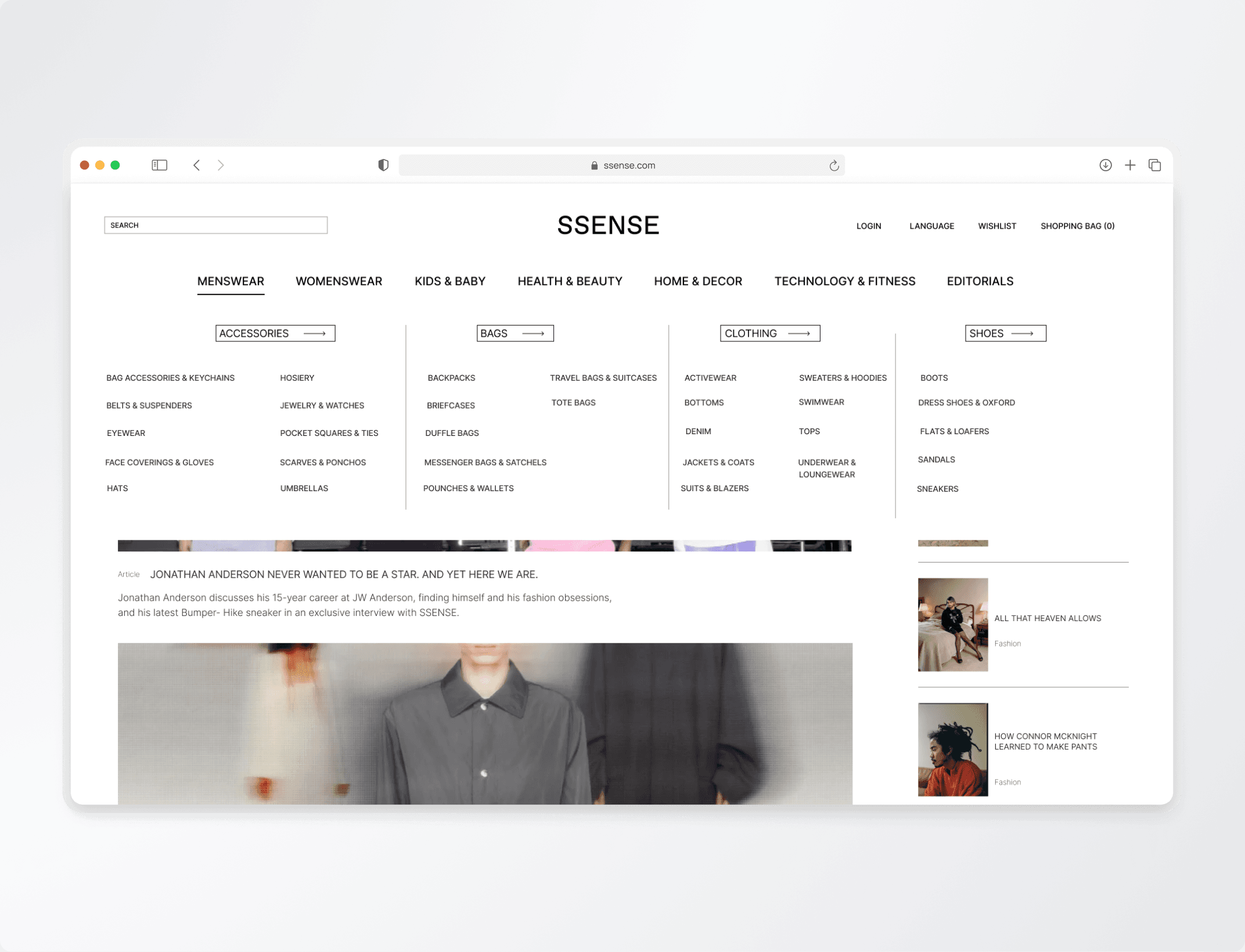
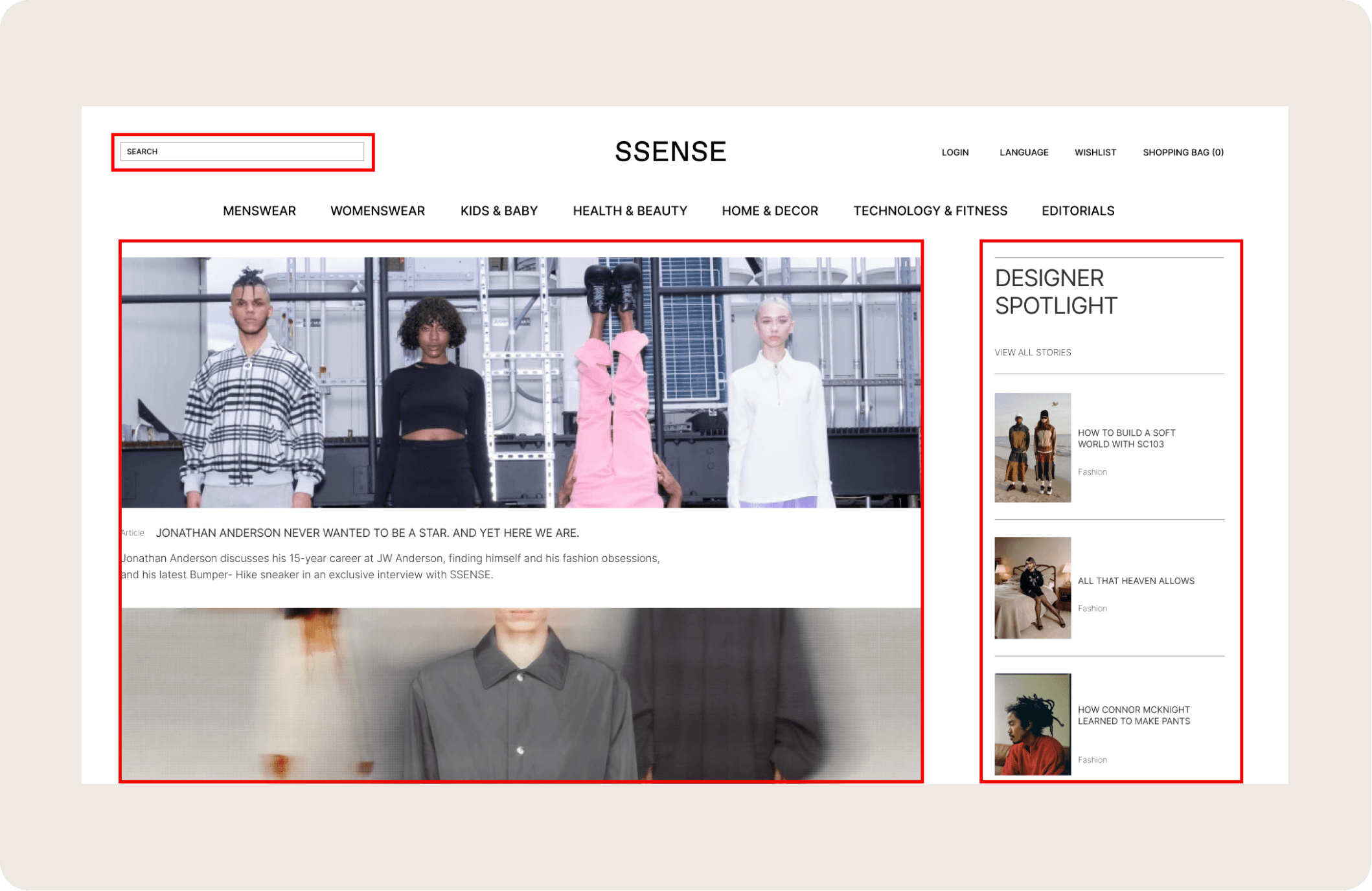
Highlighted editorials ordered in 2 vertically divided columns, hero section and “designer spotlight”, with dedicated search bar section.

New mega menu categorizes subsections of expanded primary navigation. "Everything Else" catch all divided into multiple categories ("Kids & Baby", "Health & Beauty", "Home & Decor", "Technology & Fitness", and "Editorials").
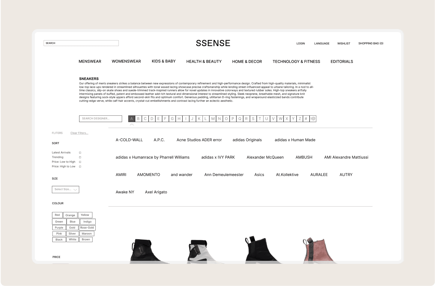
Increased hierarchical structure (font sizing, space clustering) and expanded filtration system by alphabetical order.


Product informational details and features easily visible at first glance on left side of screen, rather than below.
Product recommendations moved to right side of screen, with larger unobstructed “checkout” buttons, and addition of product recommendations for impulse pick-up.

Learnings
Branding is key.
When redesigning an existing product, preserving the brand’s core "essence" and vision is essential to maintaining authenticity and ensuring a successful outcome.
You ≠ User.
Through user interviews, testing, and empathy mapping, we uncovered pain points that challenged our assumptions, allowing for more intuitive and user-centered experiences.
Hi-fidelity prototyping.
This project marked my first experience using Figma and prototyping a design. Given the short 8-week timeline, I’m genuinely proud of what our team was able to accomplish in a realistically tight deadline.